The EasyTravel app is a mobile app develop to travel planning and has a rewards program where you win points to spend in attractions in your trip.
Project Duration: 6 weeks.
My role: Lead UX designer.
Responsibilities:
- User research
- Wireframing
- Prototyping (low-fidelity and high-fidelity)
Challenge
Travel planning usually takes time and has many essential details you need to address before traveling. Sometimes, you have to go to the agency to talk to a travel agent, which is not convenient.
Solution
An app where you can plan your travel, access a travel agent, and win points by getting a travel package through the app.
User research
Summary
I conducted interviews to understand the user I am creating for and the users' needs. A primary user group was identified as adults who want to plan their trips and spend less.
The user group confirmed some assumptions made at the beginning of the project and gave some insights about the cost that concerns the users while using a travel agent service. Also, a problem was identified with travel agents and the fixed itineraries.
Pain points
- Cost: people usually want to spend as less as possible to accomplish their goals.
- Time: travel planning usually takes a lot of time the customer doesn’t always have.
- Customization: travel agents usually have limited space for travel customization accordingly to the customers.
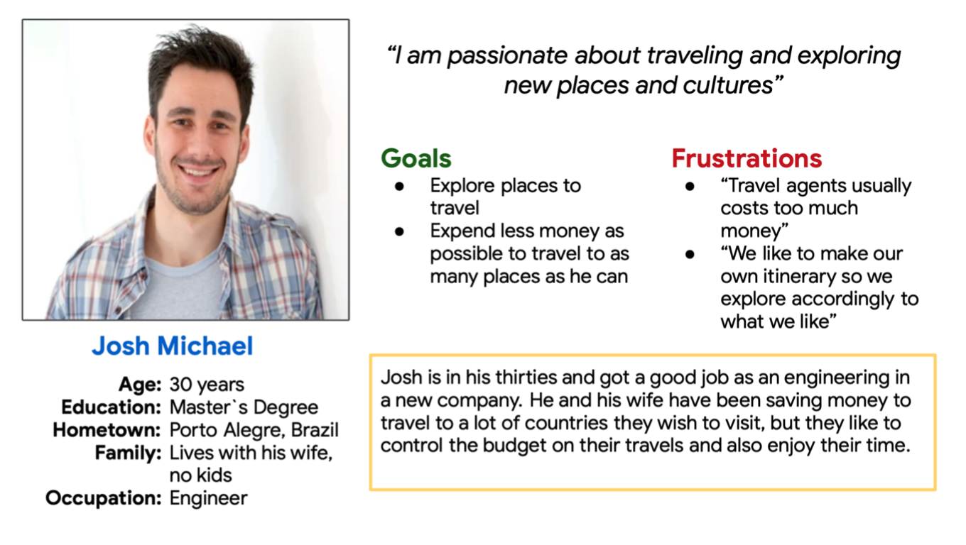
Persona
Problem statement: Josh is a busy engineer who needs an easy, fast and cheap way to travel planning because he wants to explore new places without spending too much money.
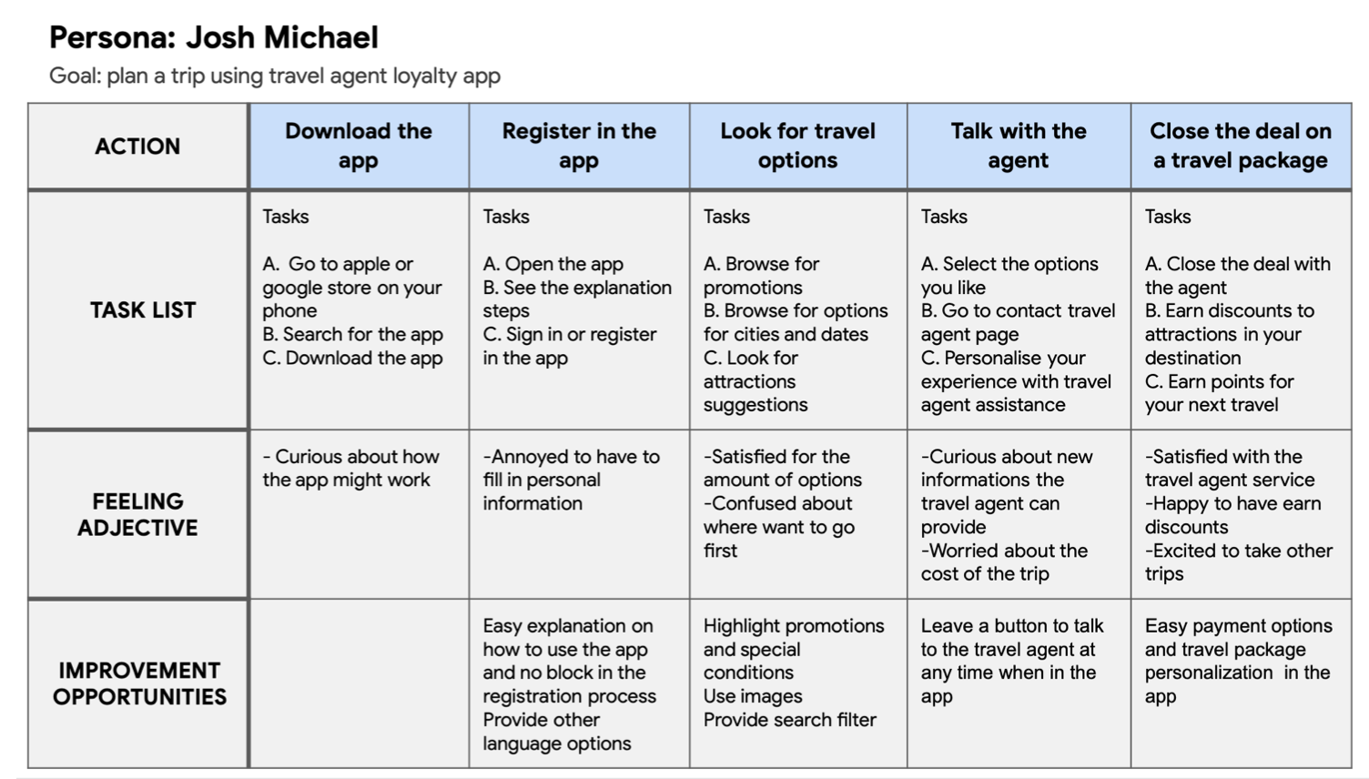
User journey map
Design
Wireframes
First, I drew the essential elements in the paper wireframes to ensure that the functionalities addressed the user pain points. The priority was making an easy-to-understand home screen for the user. Then I moved to digital wireframes using Figma.
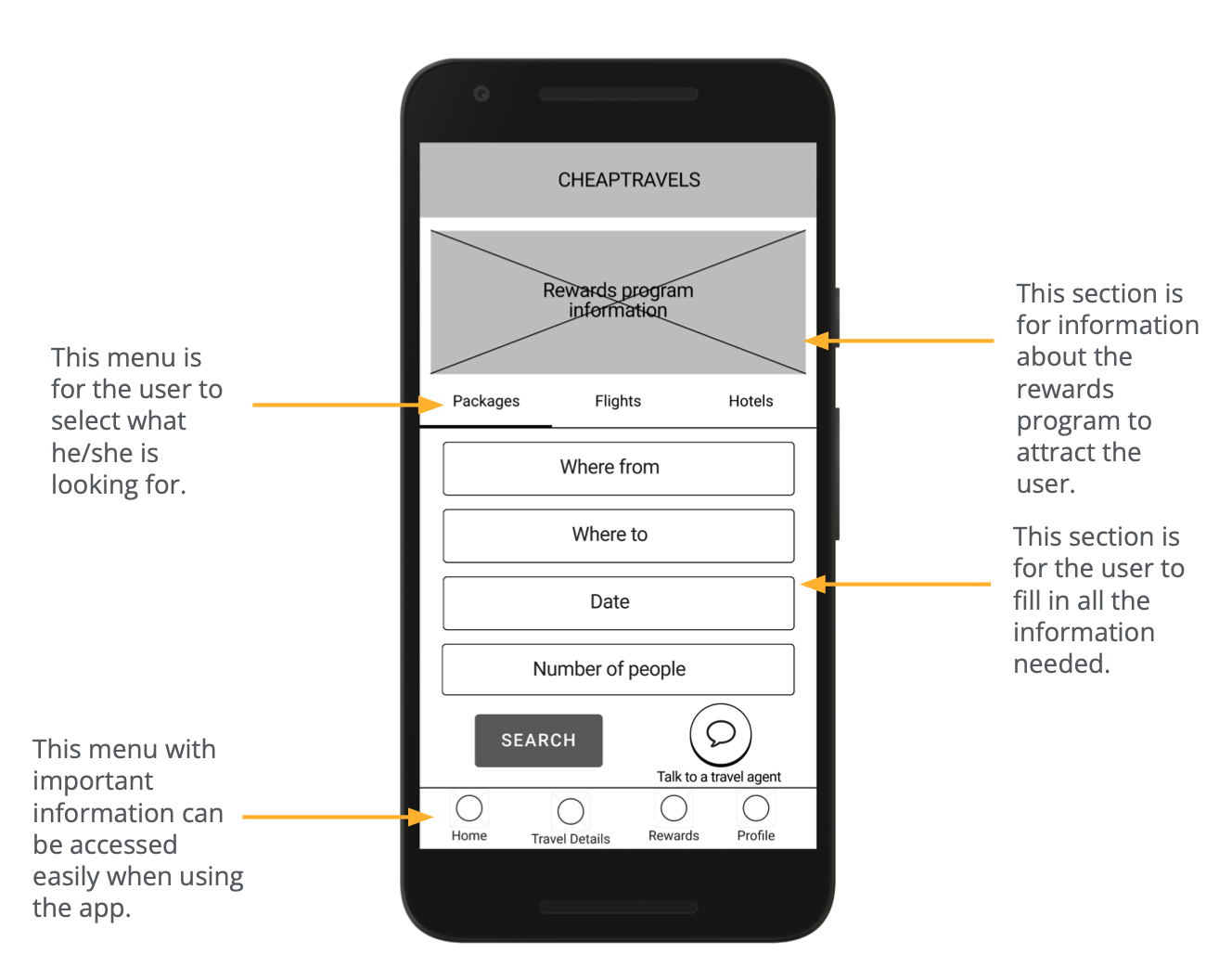
In this design phase, I made sure to add the functions to address the user's needs. I added the menus for easy and fast navigation that was a fundamental user need.
Also, it was defined that the rewards program will allow users to choose between getting benefits after payment or saving points for the next time they want to travel.
Low-fidelity prototype
The low-fidelity prototype connected the primary user flow to book essential elements for traveling and access a travel agent. The prototype was helpful in the usability study.
Usability study
I conducted two rounds of usability studies. An Unmoderated usability study was conducted with the low-fidelity prototype to understand how users interact with the app. A second usability study was conducted with the high-fidelity prototype to gain insides from potential users on how to improve the app design.
Round 1 findings
- The user needs clarity on the home page;
- The user wants agent tips and package suggestions;
- The user wants to have access to points while selecting where to use them.
Round 2 findings
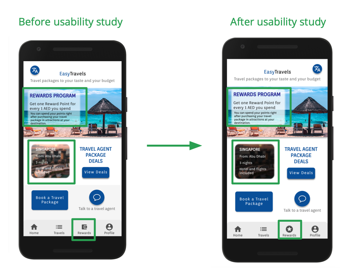
- The Rewards program icon needs to be more explicit;
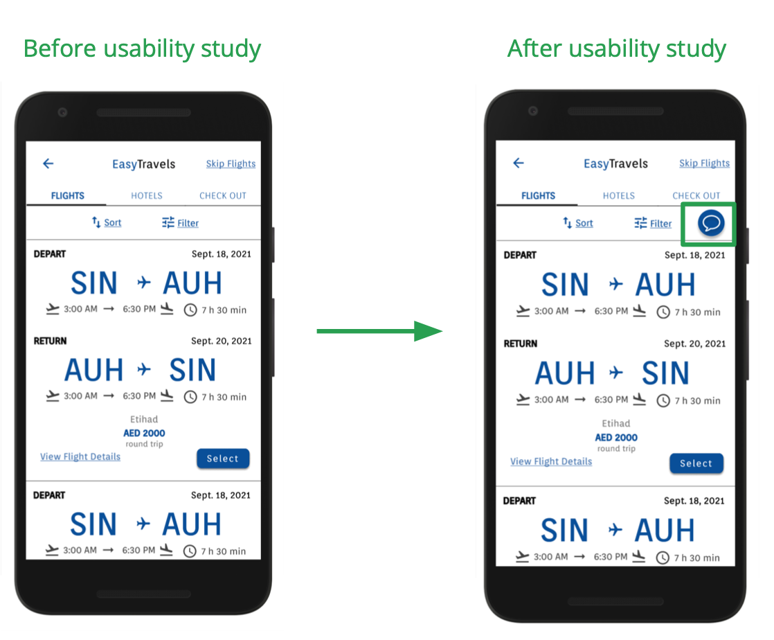
- The user wants to access the travel agent chat on any screen;
- Connect the words with pages to easy access.
Mockups
In the first homepage design, I used a wallet icon to the Rewards program that was not calling attention or easy to understand, so I changed to the star icon. Also, the text was unclear, so I edited the images so the contrast between the text and background would be higher.
I added the option to talk to a travel agent during the selection of flights and hotels. If the user has any doubts in the process, he can have easy access to help.
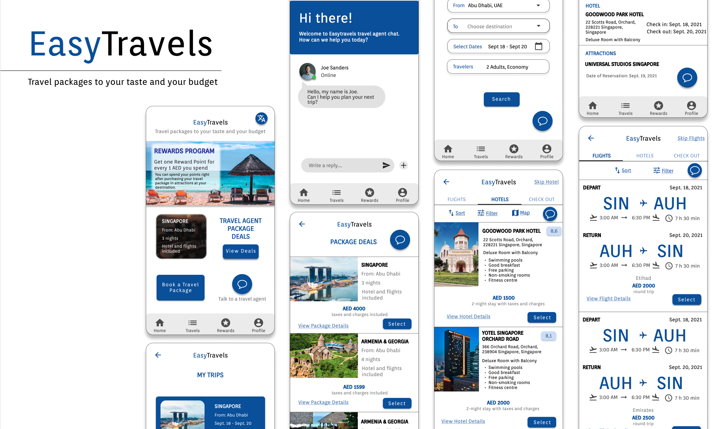
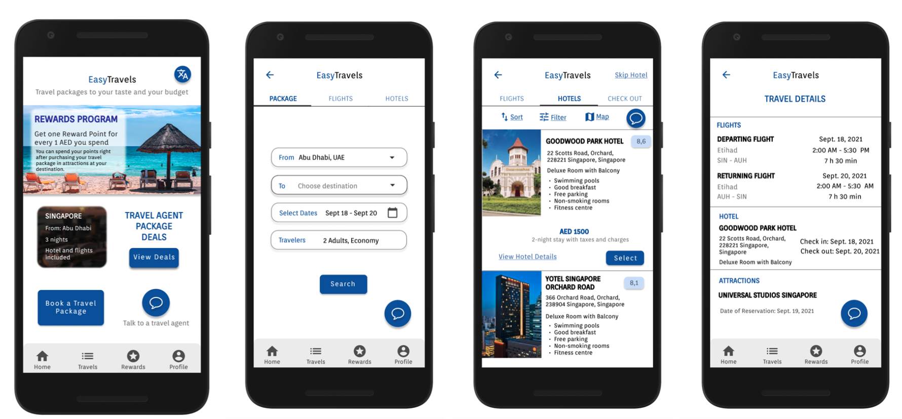
EasyTravels app mockups
High-fidelity prototype
Accessibility considerations
- The colors used were based on the accessibility standards, focusing attention on call-to-action buttons;
- The animations followed the rules for timing according to accessibility standards;
- The significant gesture in the app is Tap, considering it would be accessible for people with motor disabilities;
- Available in at least three different languages, signed by the change language button on the home page.
Takeaways
Impact: Easy to navigate travel planning app.
The app is very useful for those who are planning to travel, it is very easy to use, well organized and complete. Participant in the usability study
What I learned
- How to conduct UX research;
- How important it is to understand users needs;
- Create and access Design Systems;
- How to create wireframes, low-fidelity prototypes and high-fidelity prototypes in Figma;
Thank you for reading!