Plim is a medicine reminder app with a complimentary responsive website.
Project Duration: 2 weeks.
My role: Lead UX designer.
Responsibilities:
- User research
- Wireframing
- Prototyping (low-fidelity and high-fidelity)
Challenge
Users need help reminding them to take their medicines on time. Also, during research, I found out that it would be good to have health information all stored in one place, medications you take and when, information about vaccination status, and doctor’s appointments.
Solution
Design a dedicated mobile app and a responsive website to help people remind them to take their medications on time and access important information related to their health.
User research
Summary
I conducted interviews to understand the user I am creating for and the users' needs. A primary user group was identified as adults who take medicines or vitamins frequently.
The user group confirmed some assumptions made at the beginning of the project about how important it is for them to take their medicines on time and gave some insights about what they need in a medicine reminder app.
Interviews
For the interviews, I developed a dialogue with potential users with open-ended questions to understand their needs.
Interview questions:
- How frequently do you take medicines or vitamins?
- How hard is for you to keep track of your medicines?
- How frequently do you forget your medicines?
- What do you do to remember to take your medicines properly?
Pain points
- Time: users have a full day and sometimes don’t have time to remember to take their medicines.
- Health: taking medicines on time is a concern because it is essential for the users' health.
- Memory: it is hard to remember the times and dates of medicines, especially if you take more than one.
- Options: users like to have different schedule options.
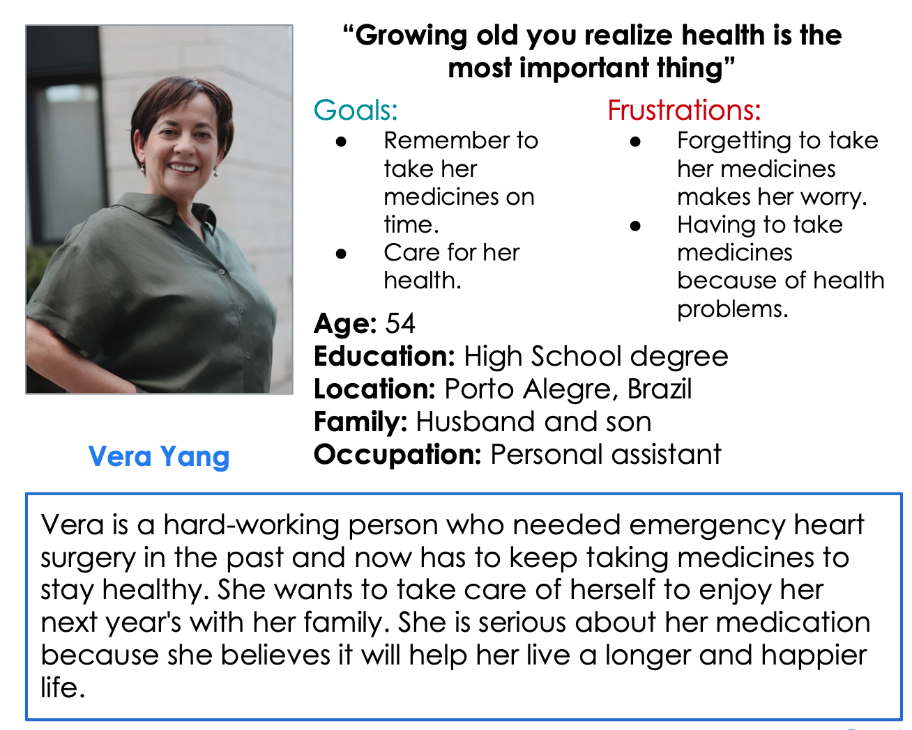
Personas
Problem statement: Vera is a senior personal assistant with a heart condition who needs to be remembered to take her continuous medicines because she needs them to stay healthy.
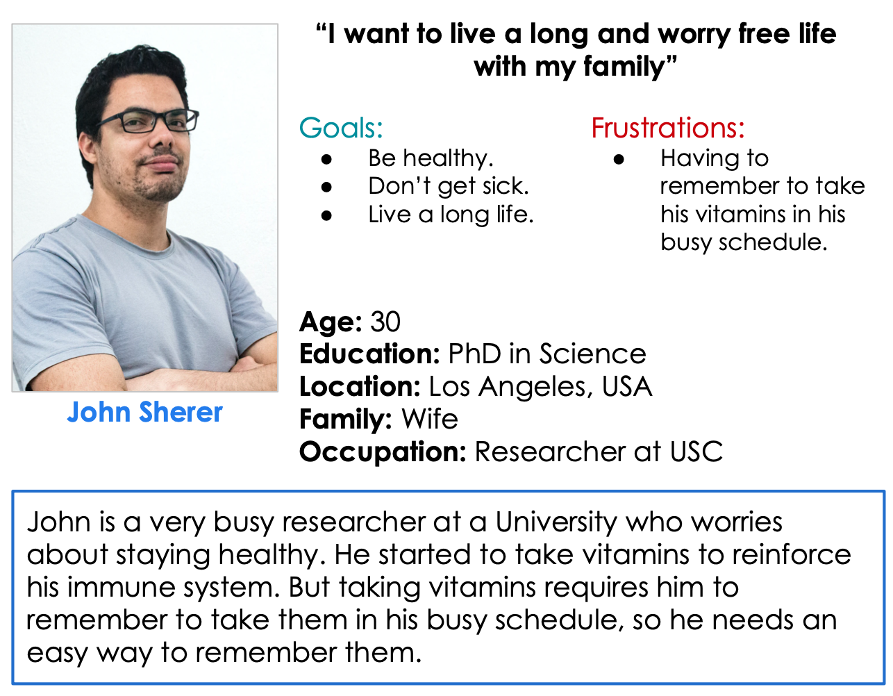
Problem statement: John is a researcher at a University worried about his health who needs to be remembered to take his vitamins because he wants to live a long and happy life.
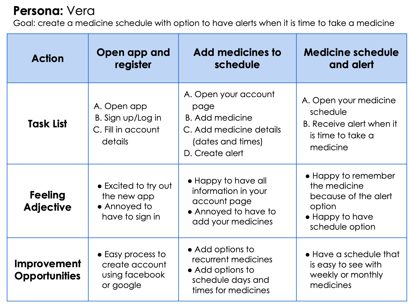
User journey map
The intent of the user journey map is to create obstacle-free paths for the user.
User stories
Vera user story: As a senior full-time worker with a heart condition, I want to take all my medicines on time so that I can live a longer and happier life.
John user story: As a full-time researcher at a University worried about my health, I want to be remembered to take my vitamins so that I can live longer.
Competitive Audit
I conducted a competitive audit with the intent to compare functions and navigation on medicine reminder apps. I compared direct and indirect competition.
In the audit, I found out that there was a gap in schedule options in the competition. I saw the opportunity to design an app with a month and weekly schedule and tracker and use gamification inside the app as an incentive to take medicines on time.
Design
Wireframes
I started with paper wireframes. In the first draft, I designed 5 options for the homepage, based on the essential elements to choose the best information architecture. After the homepage, I started creating paper wireframes for the other pages. The priority was making an easy-to-understand home screen for the user.
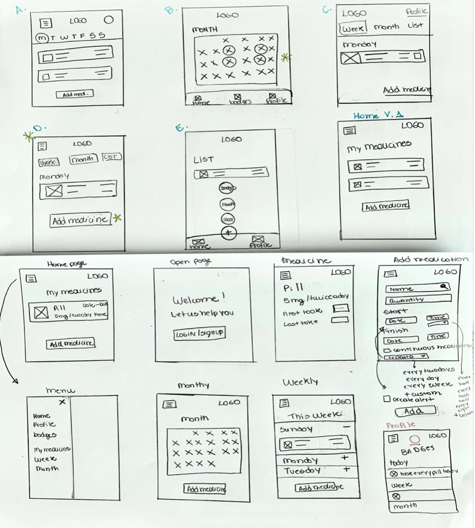
After the paper wireframes, I started with the digital wireframes in Adobe XD. I lined out the user flow to add medicines and alerts in the app. The primary concern was to obtain easy navigation and a simple design with different schedule options for the user.
The user homepage shows the list of all the medicines and a hamburger menu with other schedule options.
Low-fidelity prototype
The low-fidelity prototype connected the primary user flow and was helpful in the usability study.
Low-fidelity prototype
Usability study
An Unmoderated usability study was conducted with the low-fidelity prototype to understand how users interact with the mobile app. The steps I took in the research study were:
- Plan the study;
- Conduct the study;
- Analyze and synthesize the observations;
- Iterate on your designs based on the insights gathered from the research.
Findings
- Based on the theme that: schedule options were not clear, an insight is: update the “my medicines” page;
- Based on the theme that: the option to log taken pills was not intuitive, insight is: create a new section with a question for the selection button;
- Based on the theme that: the app could have more options when adding new medication, an insight is: we can add weekdays options.
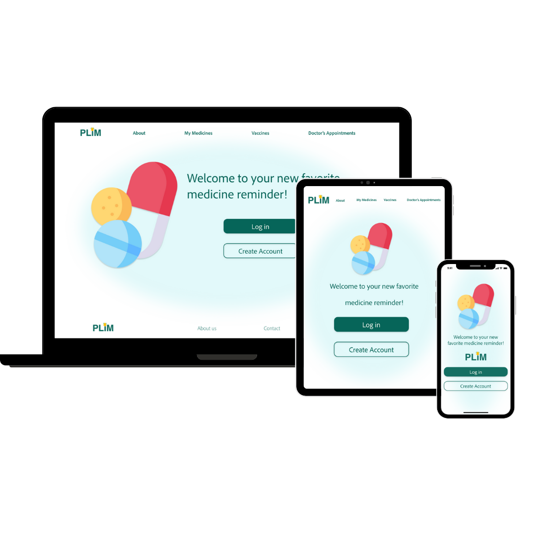
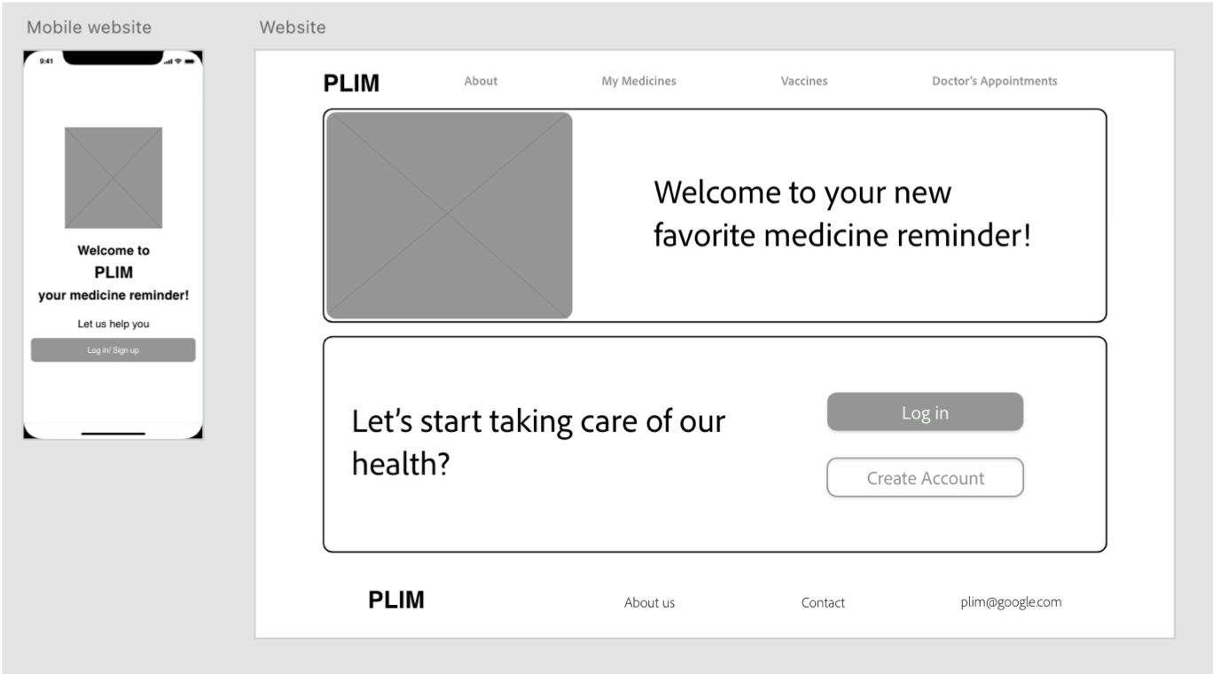
Responsive website
From the app, I started developing a website version for Plim. The website's purpose is to have a medicine information website to keep track of medicines, vaccination, and doctor's appointments. I started with the mobile app wireframes to develop a desktop version for the website. For some elements like typography and buttons, I used the same design system from the high-fidelity design for the mobile app.
Mockups
The first step was to design a dedicated mobile app. This app's design system was created based on a specific color palette and some icons available online. Also, the design system was based on IOS because my previous work was android based and I wanted to explore another mobile operating system.
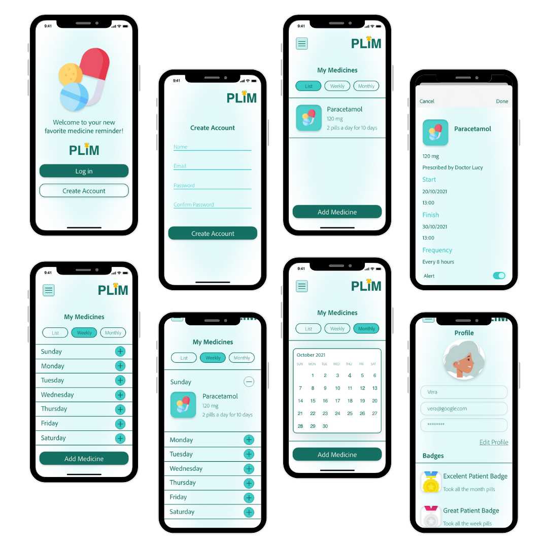
The app's purpose was to keep track of your medication, reminding you to take them at the correct times with 3 options on how to see your medications.
The unique proposition of the app is in the different types of ways to present your medication schedule and a badge system for when you take the medication in the correct times.
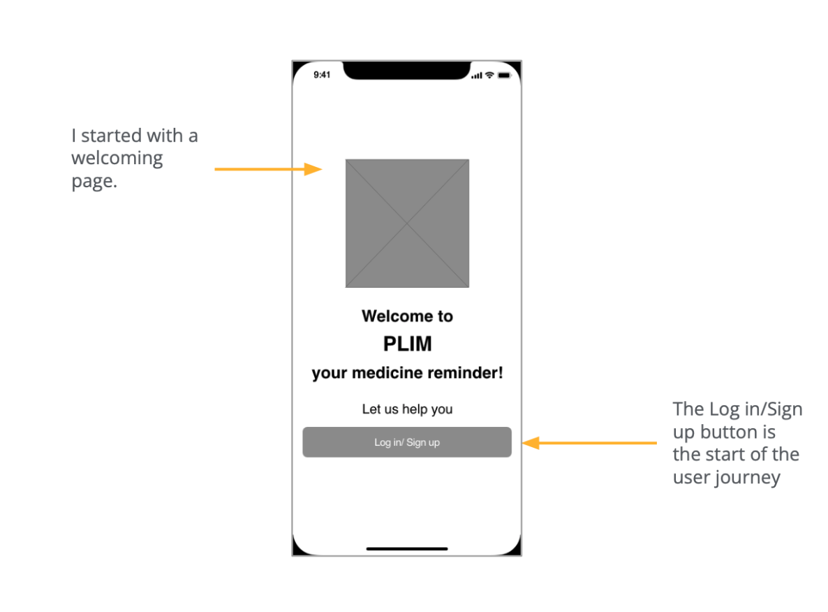
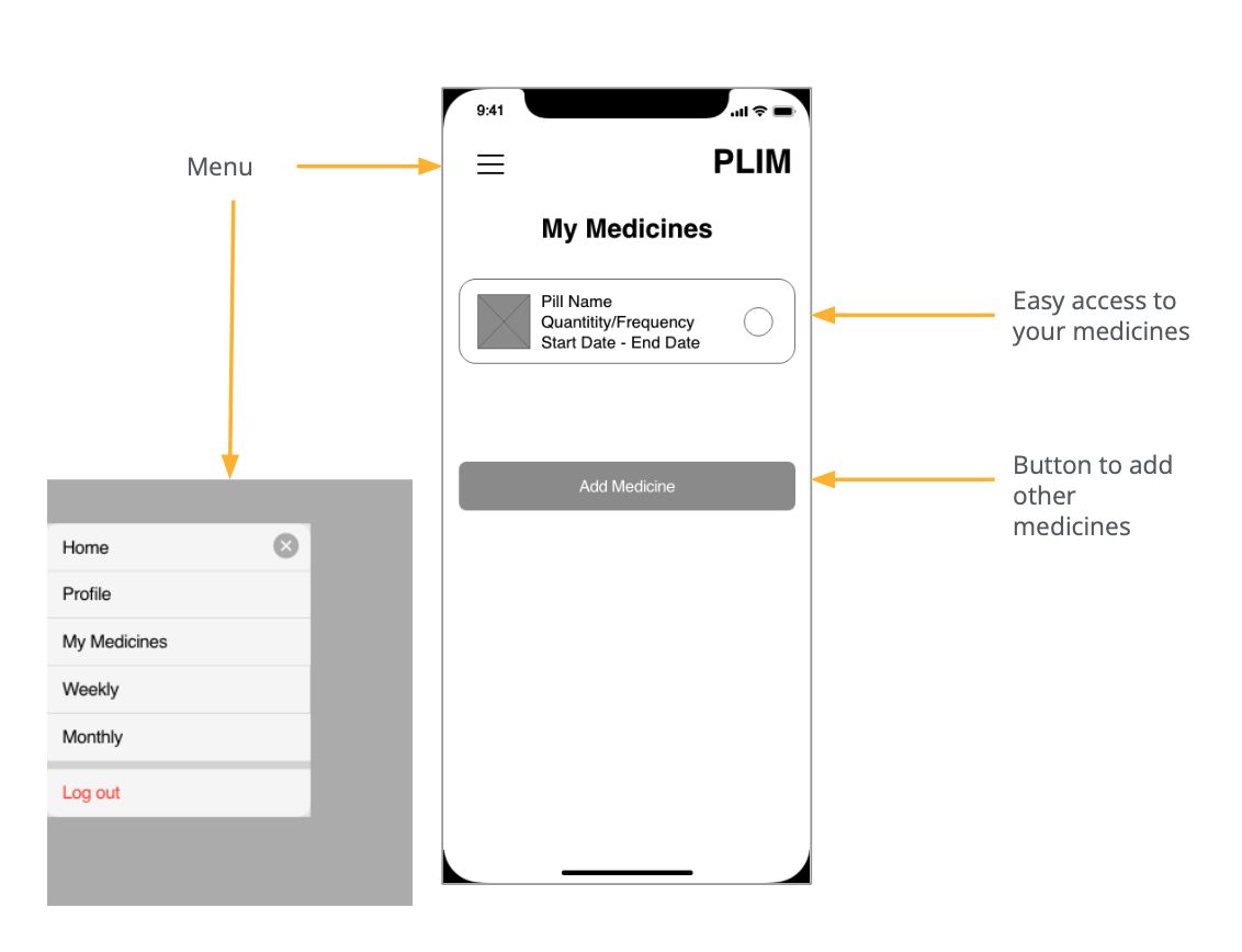
Dedicated mobile app high-fidelity prototype
High-fidelity prototype
Responsive website
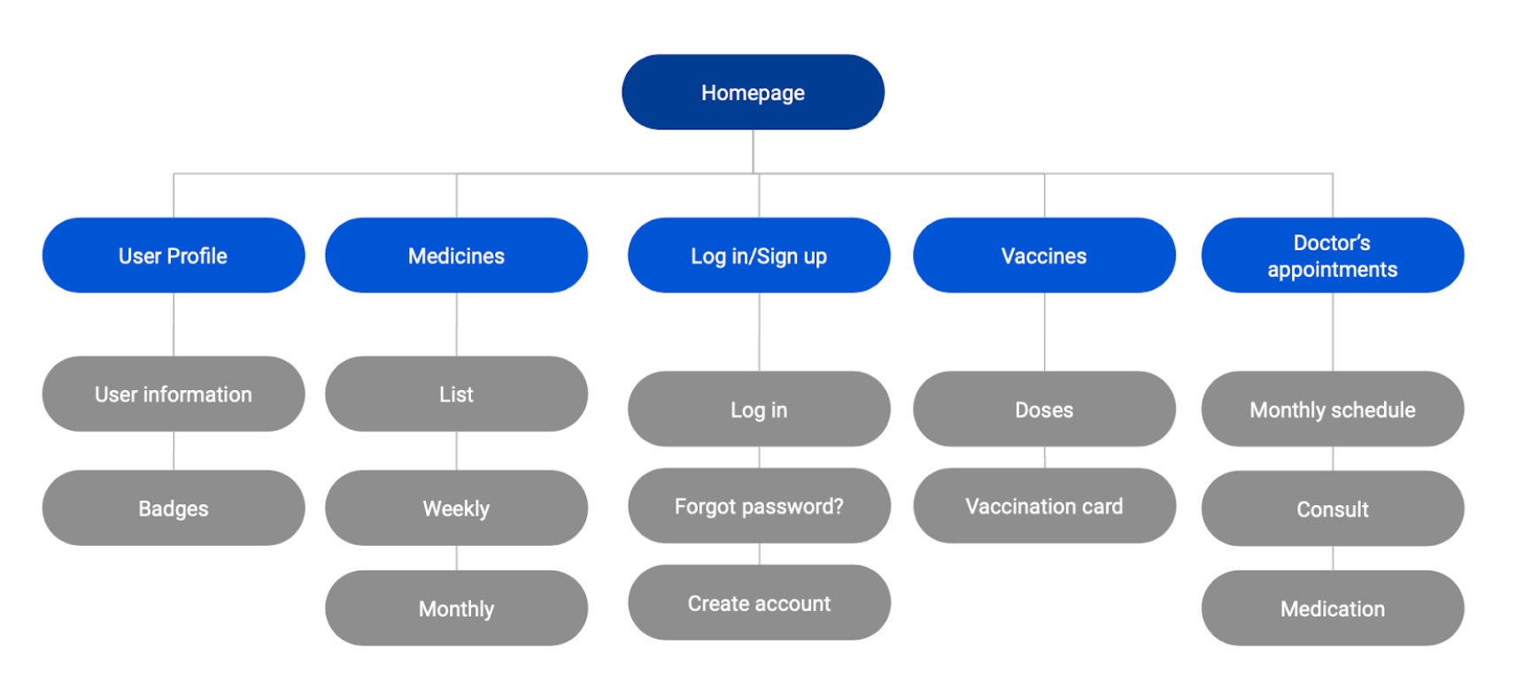
I started with the sitemap for the responsive website.
Then I did the website mockups following the consistency principle using the same color palette as the mobile app and the responsive website high-fidelity prototype.
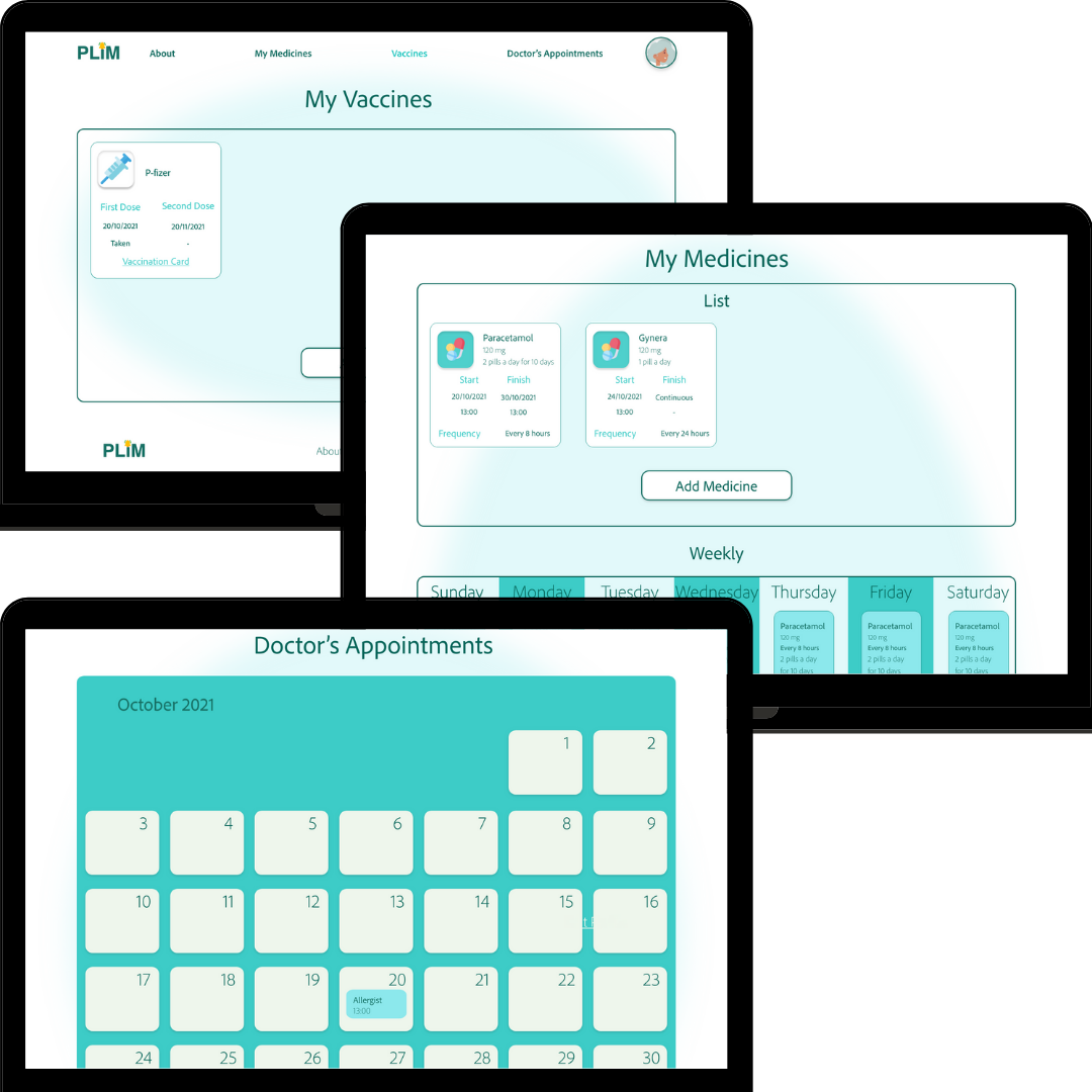
Responsive website high-fidelity prototype
High-fidelity prototype
Takeaways
Impact: Easy to understand medicine reminder app and responsive website.
What I learned
I practiced all the steps in the design process with a project done by myself from beginning to end.
- Dedicated mobile apps
- Responsive websites
Thank you for reading!