Hungry is a mobile app to find restaurants and delivery options nearby.
Project Duration: 1 week.
My role: UI designer.
Responsibilities:
- Mockups
- Icons
- Typography
Challenge
Users need help finding restaurants with specific kinds of food in restaurants nearby.
Solution
A mobile app rapidly finds the meal for people who can’t cook in nearby restaurants.
Defining the look and feel
Tagline
Can’t cook? Craving something? Let us help you find it.
Main function
User will select on the app their location and what they want to eat, and in return, we will show on the app screen map the best restaurants and delivery options that have the food you wish so you can have a great meal wherever you are, whenever you need.
Mood board
The mood board contains the visual research for my project idea.
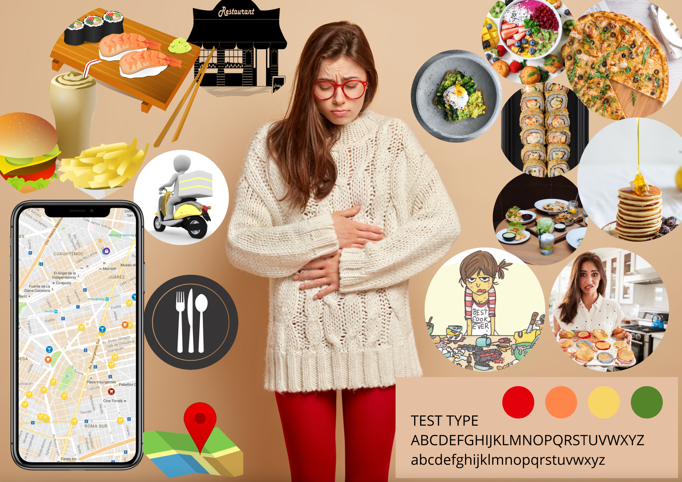
The project brief was an app that finds a specific food within a given area, so I let the user select this particular food. In this sense, more people could use the app and not just a tiny niche.
The app focuses on finding food locations, which means that the user could be somebody who does not know how to cook. So my mood board translates this idea of various food options and places where you can eat your food. I got a review about not showing the user on the board, so I added images that represent the user who does not know how to cook to get a complete feeling of the app.
You did a great job selling the energy or the mood tied to hunger. You also did a great job providing the solutions to that hunger. I also loved the way that you put your mood board together. Course feeback
Sample Pattern Library
I created a sample pattern library with buttons and icons based on the mood board and feedback.
![]()
Static Interface
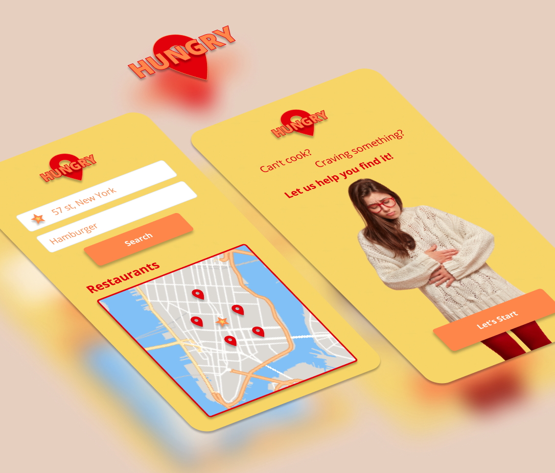
Lastly, I did a sketch of two static interfaces.
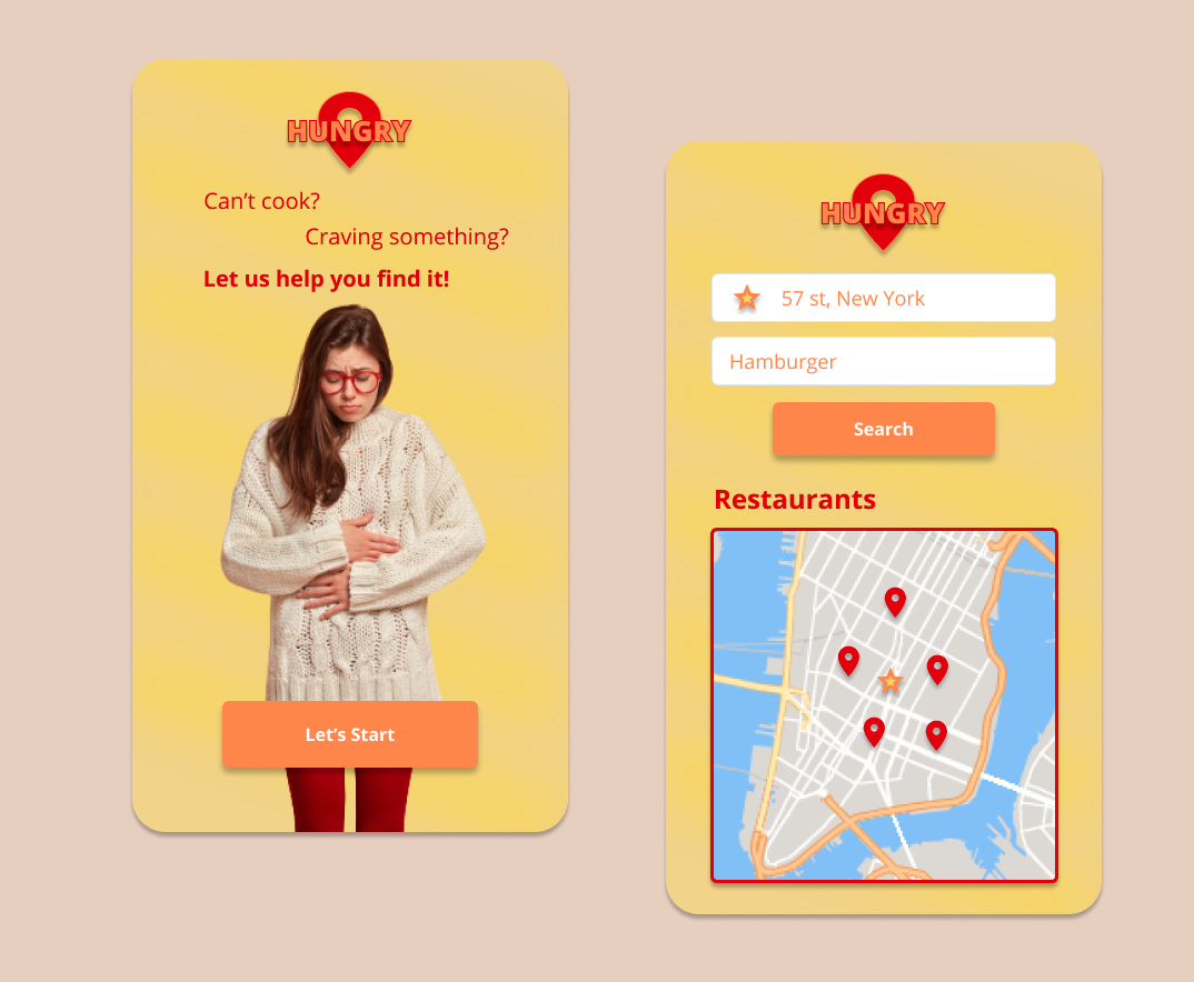
The app looks very easy and fast to use, so that the user can quickly open it whenever he is hungry. Course feeback
Takeaways
Impact: Easy to understand food finder mobile app.
The visual identity is very good in my opinion. I also like the color palette and the use of red, which is associated with hunger. Course feeback
What I learned
I learned to mix creativity and functionality in mobile apps. This process helped me realize that even if you follow app conventions about composition and structure, you can still create a unique user experience.
Thank you for reading!