Recipes2go is a mobile app where you can store your own recipes and search for recipes.
Project Duration: 1 week.
My role: UX and UI designer.
Responsibilities:
- Wireframing
- Mockups
- Prototyping (low-fidelity and high-fidelity)
Tagline
Store and share your cook memories.
Challenge
Some people still have their old recipe books that can get damaged, lost, and occupy kitchen space while cooking. The users need a space to save their recipes and access them no matter where they are.
Solution
Recipes2go is an app where the user only needs their phone to store new recipes and access old ones at any time and anywhere.
Users
Target group: cook lovers, housewives, chefs, and people who want to learn to cook.
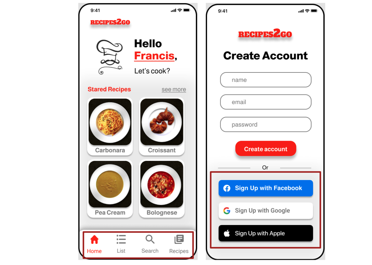
Potential user: Francis Roberts
- New York
- 27 years old
- Student
- Lives with her husband
- Likes to cook for family and friends
- She is passionate about her grandma's culinary and want to store the recipes for future generations
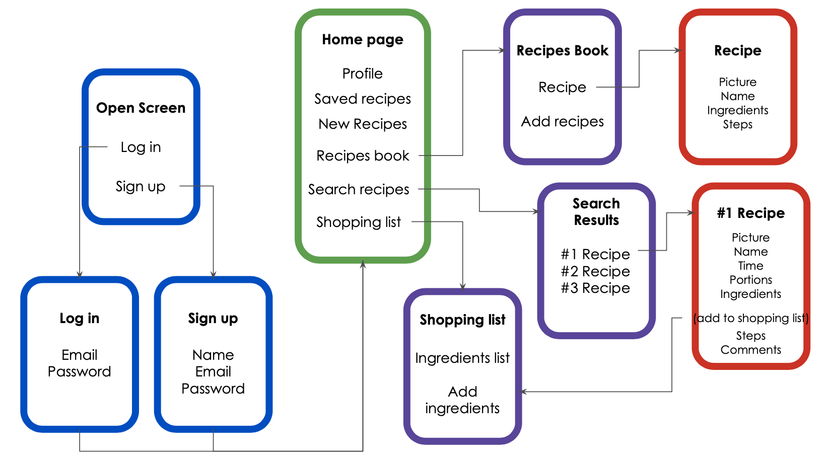
Sitemap
The process started with a simple content map that was useful in planning and developing the content. Later, I built a flowchart to visually understand how the user would travel through the content. That was important to come up with the sitemap that was used when I started building wireframes.
Design
Wireframes
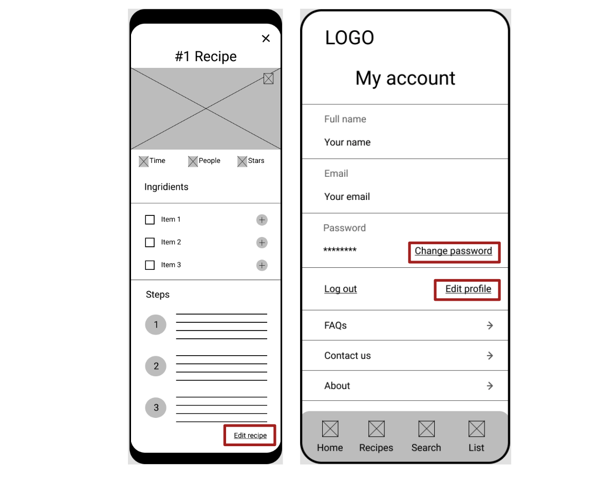
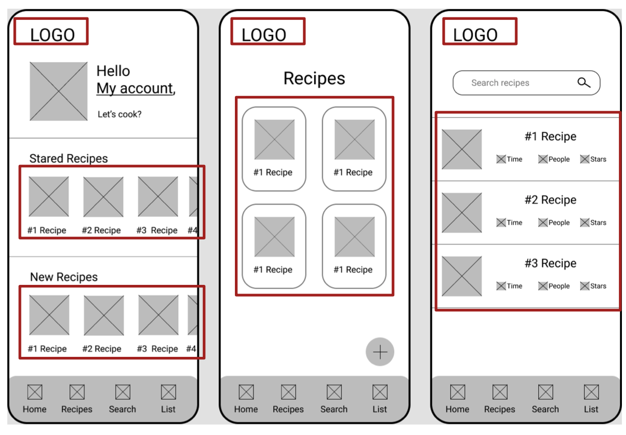
I wanted to make sure that the wireframes had all the functionalities determined in the sitemap.
Specific functions of the app:
- Store your own recipes
- Search for recipes within the community
- Save recipes you like
- Make a market list of ingredients for your recipes
In the wireframes, I started checking and applying Nielsen's Usability Heuristics.
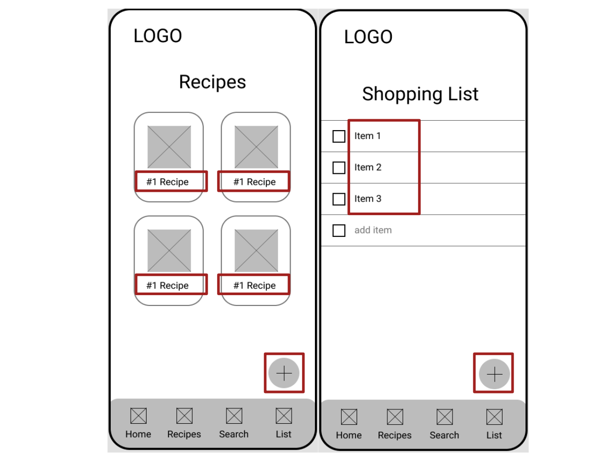
Giving the user the option to edit information is under the user control and freedom heuristic.
Used the similarity principle to group recipes. And the consistency principle on the logo in the same place on all screens.
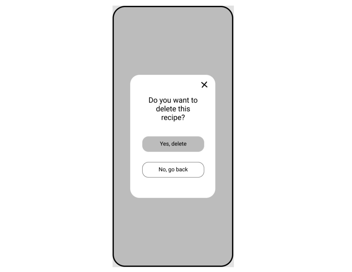
Overlay screen to confirm before making major changes under the error prevention heuristic.
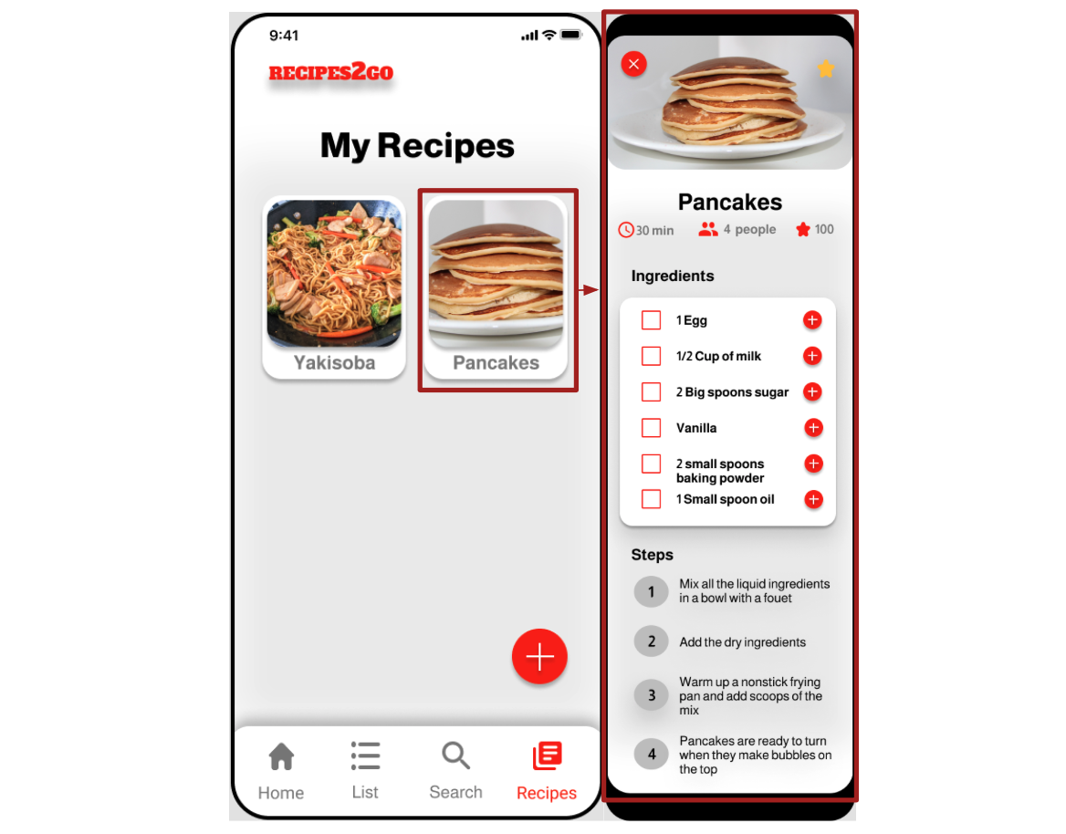
I decided to leave only important information on the screen (recipe name and item name) so that is no excessive text. Also, used an icon button to add new information. This was thought under the aesthetic and minimalist design heuristic.
When editing a recipe, the user can easily edit the information by just clicking on the text in a light color. The screen has a grammar checker to provide solutions quickly and easily.

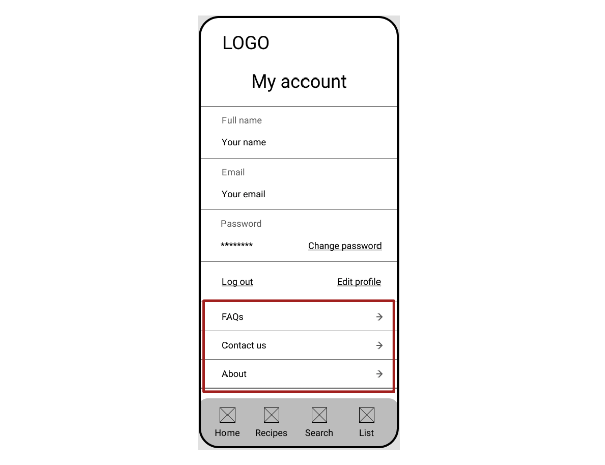
There is access to FAQs, a contact us page, and an about page to help users and provide documentation on the My account page. This information has easy access, but it is hidden until it is needed.
Low-fidelity prototype
The low-fidelity prototype was an interactive version to test the app's functionalities.
Mockups
In the mockups, I continued to check and apply Nielsen's Usability Heuristics.
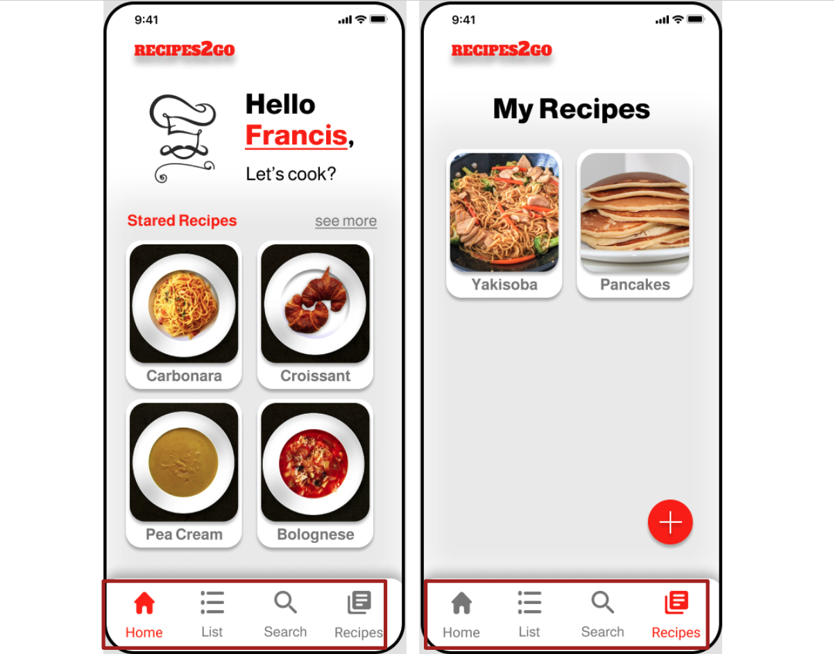
Under the visibility of system status, I applied different colors to the menu to show the users on which page they were.
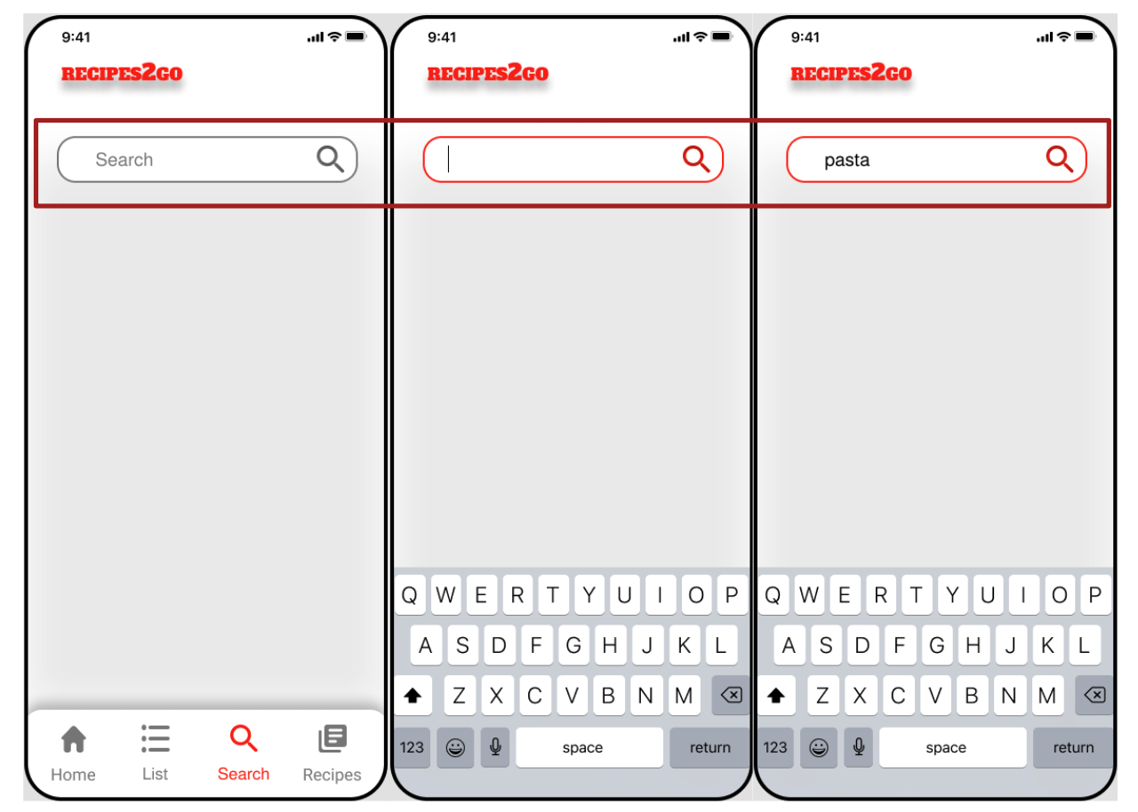
I also used three different outlined text fields to show status (inactive, active, and inactive and populated).
To match the system and the real world, I used elements that are standardly used, such as a house for home, magnifying glass for search, and Facebook, Google, and apples symbols and colors.
The interaction is visible and immediately, when you click on the recipe it shows you the complete information about the recipe under the Recognition rather than recall heuristic.
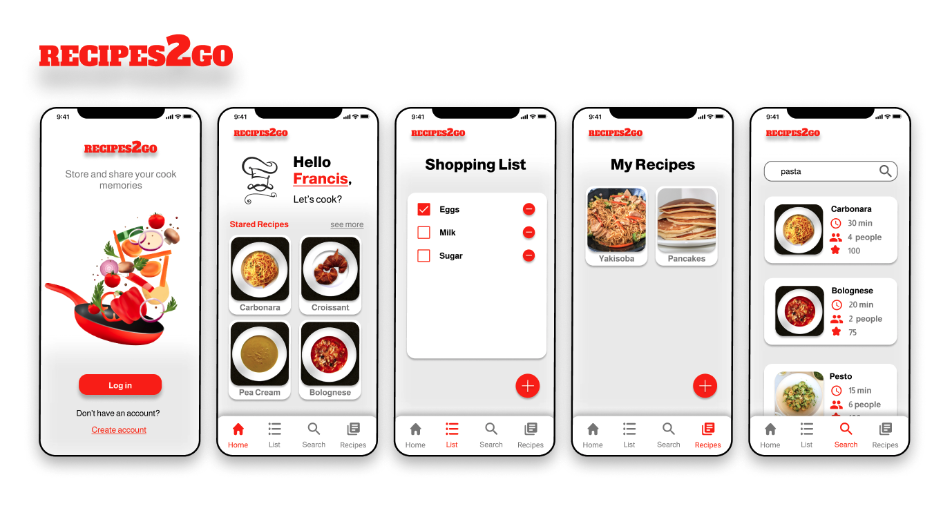
High-fidelity prototype
Accessibility considerations
- The colors used were based on the accessibility standards, focusing attention on call-to-action buttons;
- The animations followed the rules for timing according to accessibility standards;
- The significant gesture in the app is Tap, considering it would be accessible for people with motor disabilities.
Takeaways
Impact: Easy to save and share recipes app.
Everything looked very well put together and cohesive. Course feeback
What I learned
- Create visual elements for UI;
- How to apply Nielsen's Usability Heuristics in mobile apps;
- Create and access Design Systems;
- Practice wireframes, low-fidelity prototypes and high-fidelity prototypes in Figma;
Thank you for reading!